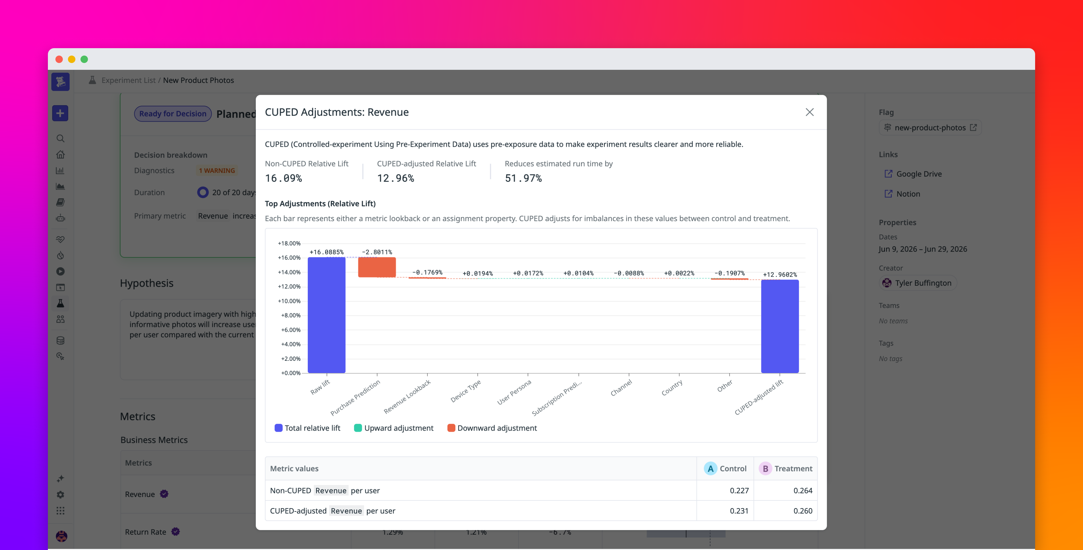
Visualize how CUPED adjusts experiment results with Datadog
Datadog | The Monitor blog

Visualize how CUPED adjusts experiment results with Datadog


Summary

Datadog Experiments has introduced a new visualization tool that breaks down the difference between raw and CUPED-adjusted lift into a sequential waterfall chart. By tracing each individual covariate adjustment, such as metric lookbacks and assignment properties, the feature helps experimenters understand exactly which factors most heavily influenced their final estimates.
Read the Original Article

This article originally appeared on Datadog | The Monitor blog.

Read Full Article on Original Site


Popular from Datadog | The Monitor blog

1
DASH 2026: Guide to Datadog’s newest announcements

Datadog | The Monitor blog Jun 9, 2026 257 views

2
DASH 2026 Harnessing AI: Guide to Datadog’s newest announcements

Datadog | The Monitor blog Jun 9, 2026 210 views

3
Datadog LLM Observability natively supports OpenTelemetry GenAI Semantic Conventions
4
Introducing Bits AI Dev Agent for Code Security

Datadog | The Monitor blog Mar 26, 2026 142 views

5
Instrument and monitor Boomi integration flows with OpenTelemetry and Datadog

Datadog | The Monitor blog Apr 9, 2026 141 views