APM Dashboard: What It Shows, How to Use It, and What to Look For
Observatory | The New Relic Blog

APM Dashboard: What It Shows, How to Use It, and What to Look For


Summary

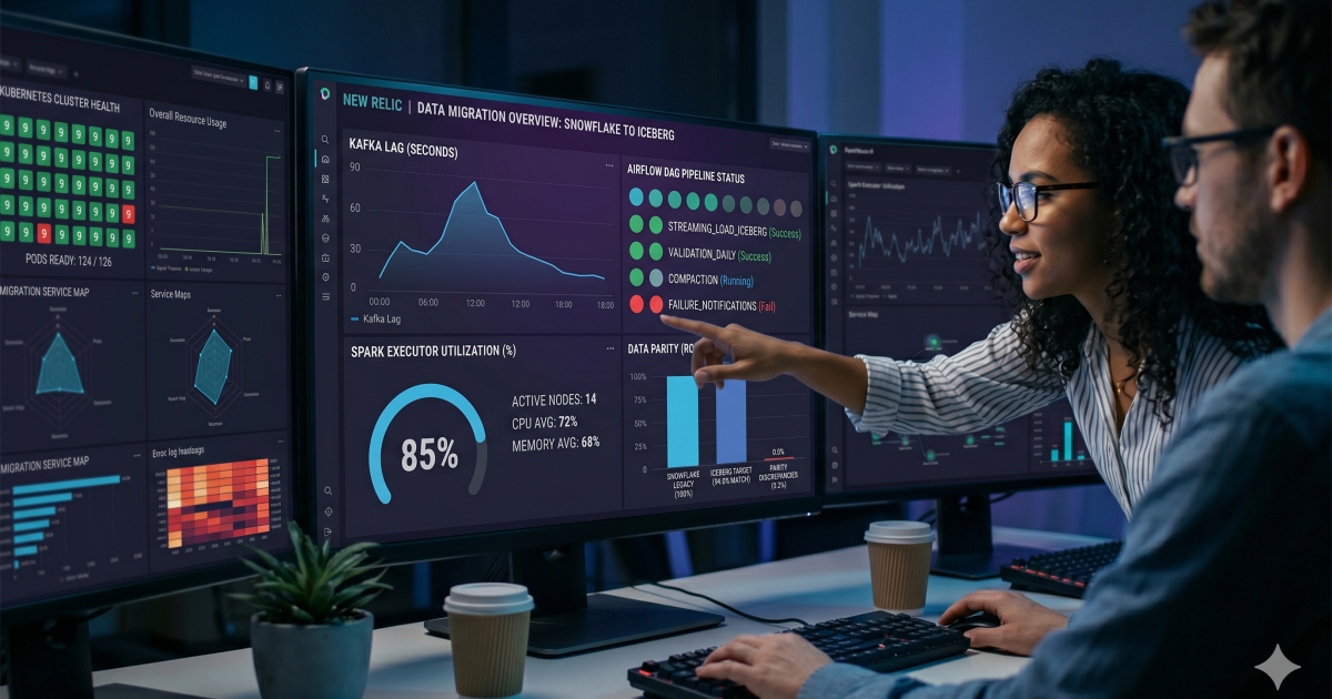
This guide explains how engineering teams can leverage APM dashboards to accelerate troubleshooting by unifying metrics, logs, traces, and infrastructure data into a single, actionable view. It compares popular monitoring tools—such as New Relic, Datadog, and Dynatrace—emphasizing that the most effective dashboards prioritize rapid root cause identification over aesthetic design.
Read the Original Article

This article originally appeared on Observatory | The New Relic Blog.

Read Full Article on Original Site


Related Articles

Proactive Monitoring Tools: Stop Reacting to Incidents After They Happen

John Blust Sep 3, 2026 3 shared categories

Multi-Cloud Management Tools: A Practical Guide for Engineering Teams

John Blust Sep 3, 2026 3 shared categories

Enterprise APM: How to Choose Application Performance Monitoring at Scale

John Blust Sep 3, 2026 3 shared categories

Choosing the Right GCP Cost Optimization Tools for Your Environment

John Blust Aug 24, 2026 3 shared categories

JavaScript Monitoring Tools: A Developer's Guide to Choosing the Right One

John Blust Aug 24, 2026 3 shared categories

Popular from Observatory | The New Relic Blog

1
New Relic eBPF Expands Kernel-Level Observability

Ben Rivera Apr 30, 2026 151 views

4
How to Choose Network Monitoring Tools You Can Act On

Spence Taylor Apr 6, 2026 148 views